The Vanilla Lie: Why We're OBSESSED With Neutrals (The Non-Boring Kind)
It’s not about banning colours; it’s about banishing BLAND. Here’s how to wield whites, greys, and creams with with the audacity they deserve.
Okay, gather 'round, design renegades and colour warriors! Let's clear the air, shall we?
The No-Vanilla Design Manifesto has been ruffling some perfectly pressed, beige linen feathers, and we hear the whispers: "Are they… anti-neutral? Do they want us all living in neon-soaked chaos?"
Let us be unequivocally, LOUDLY clear: We are NOT anti-neutral. We are anti-BLAH.
Our beef isn't with the colour vanilla, or its cousins ecru, greige, or putty. Our crusade is against the beigification of interiors – that suffocating blanket of "safe," uninspired choices that screams "I'm too scared to have an opinion!" It's the design equivalent of elevator music: present, inoffensive, and utterly forgettable.
Vanilla, in our manifesto, isn't a hue; it's a mindset. Vanilla is choosing a colour not because you love its subtle depth or how it makes the light dance, but because it's the default, the path of least resistance, the colour of giving up before you've even started.


But Neutrals? Done with BOLDNESS and INTENTION? Oh, honey, that’s where the magic happens.
Think of intentional neutrals as the strong, silent type in a Hollywood blockbuster. They might not be shouting the loudest, but their presence is powerful, foundational, and utterly captivating. They create a stage for life, for texture, for light, for you.
So, how do you embrace the No-Vanilla Neutral? How do you wield these quiet powerhouses with the audacity they deserve?

Here’s Your No-Vanilla Neutral Action Plan:
Texture is Your Secret Weapon:
Vanilla: A flat, beige wall with a flat, beige sofa and a flat, beige rug. Snooze.
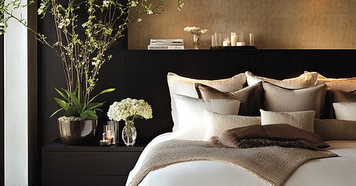
No-Vanilla Neutral: Imagine a room swathed in varying shades of charcoal grey. One wall in a tactile, light-absorbing limewash. A deeply textured boucle armchair. A rough-hewn, dark wooden coffee table. A high-pile wool rug that begs for bare feet. Suddenly, that charcoal isn't just grey; it's a symphony of touch and shadow.
Try This: Layer different textures in similar neutral tones. Think nubby linen curtains, a velvet cushion, a polished concrete floor, a raw silk throw.
Embrace Extreme Contrast (Within Neutrality):
Vanilla: Everything is a mid-tone, muddy greige. Nothing pops. Nothing recedes.
No-Vanilla Neutral: Go for stark. Pair a deep, almost-black charcoal with a brilliant, gallery-white. Use one as the dominant colour and the other as a sharp, defining accent. This isn't just contrast; it's drama, it's definition, it's intention.
Try This: Paint your walls a rich, deep mushroom and trim them in a crisp, cool off-white. Or consider black window frames against pale stone-coloured walls.
Let Form Be the Hero:
Vanilla: Boxy, unremarkable furniture lost in a sea of sameness.
No-Vanilla Neutral: When your colour palette is restrained, the shape of things becomes paramount. A stunning, uniquely shaped armchair in a rich cream linen becomes a sculptural statement. An oversized, organically shaped pendant light in a matte bone finish commands attention.
Try This: Invest in one or two pieces of furniture with a truly striking silhouette, upholstered in a quality neutral fabric. Let them breathe – don't crowd them.
Play with Light and Sheen:
Vanilla: Everything has the same dull, matte finish.
No-Vanilla Neutral: A high-gloss, lacquered ceiling in a soft putty reflects light and adds unexpected glamour. A matte, chalky wall finish absorbs light, creating a cozy, enveloping feel. The subtle shimmer of a silk-blend rug versus the light-dampening quality of a sisal.
Try This: In a predominantly matte neutral room, introduce one element with a high sheen – perhaps a lacquered console table, a polished metal lamp, or even a collection of glazed ceramic vases.
The Neutral Backdrop for YOUR Boldness:
Vanilla: The neutral is the entirety of the story, and the story is short.
No-Vanilla Neutral: A thoughtfully chosen neutral scheme can be the perfect canvas for your personality. It allows your vibrant art collection, your treasured antique textiles, or your bold, colourful ceramics to truly sing without competing. The neutral becomes the strong, supportive friend.
Try This: Create a gallery wall of your most beloved, eclectic art on a beautifully textured, warm white or soft grey wall. The neutral provides the calm; the art provides the chaos (the good kind!).
The takeaway? Neutrals are not the enemy. Fear is the enemy. Default is the enemy. Choosing a colour (or lack thereof) without passion, without a story, without a why – that’s the vanilla we’re fighting against.
So, go forth and neutralise – but do it with guts, with texture, with intention. Make your neutrals roar, even if it’s a sophisticated, deeply resonant roar.
What are your favourite ways to use neutrals with bold intention? Drop your wisdom in the comments below – let's build this No-Vanilla Neutral revolution together!
Stay Bold,
Love, Penelope xx
Chief Anti-Vanilla Officer
The No-Vanilla Design Manifesto HQ


